HOME | BISQUE DEMO | CONTACT US | KEN PERRYMENT GALLERY | MARTY McCORMACK GALLERY

Demonstration of the Bisque

Understanding the Bisque

The example of the candle below, taken from the guidebook, shows how a drawing is "built", layer by layer. The appropriate colours and manufacturers are identified.

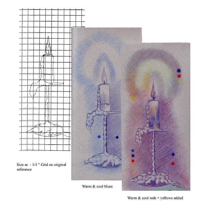
Step 1: (left-hand sketch below):

Map your subject, sketching it at the desired size using a soft (e.g., 2B) graphite pencil. A suggested method is to use a grid to provide proportional scaling, usually at a simple multiple (e.g., 2X, 3X) of the original size of the reference.


Step 2: (centre sketch below)

Draw the subject, in moderate detail, in cool and warm blues. Examine the reference carefully to determine whether the subject has a "cool side" and a "warm side."

Cool blue: Derwent Spectrum Blue pencil (#32B)
Warm blue: Derwent Prussian Blue pencil (#35B)


Step 3: (right-hand sketch below)

Add cool and warm reds and yellows. At this stage, do not blend these colours into the blues, but simply add the reds and the yellows as successive layers.

Cool red: Derwent Geranium Lake pencil (#15B)
Warm red: Derwent Crimson Lake pencil (#20B)

Cool yellow: Derwent Zinc Yellow pencil (#1B)
Warm yellow: Derwent Deep Cadmium pencil (#6B)
candelr.jpg

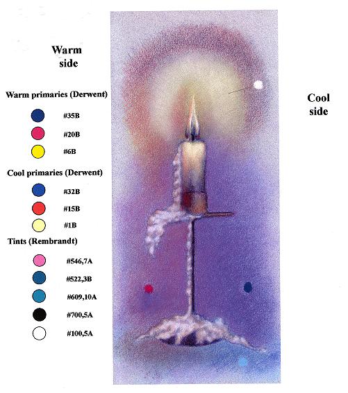
Step 4: (completed drawing below)

Add tints, to highlight the high points of reference (lightest tones) and areas of deeper shadow (darkest tones). When drawing in pastel, work tints in from darker to lighter areas of the subject. Use the outside tip of your little finger to gently blend the tints into the previously-applied layers of primaries.

fig4.jpg

This demonstration is presented in the guidebook as Demo 1, pp. 6 - 7. Other demonstrations in the guidebook show how to apply the bisque technique to more complex projects: a drawing of a dog (Demo 2), and young and adult human head-and-shoulders portraits (Demos 3, 4, 5).


General suggestions on technique

- Apply the blues, reds, yellows in that order.

- Cross-hatch these colours in, working them up to match the colours in the reference as closely as possible.

- Use varying pressure, so that the bisque works into the surface of the artwork appropriately.

- When drawing in pastel, work from dark to light.

- After the first pass (adding tints as in step 4 above), go back to the cool and warm primaries.

- Rework to add detail and to tighten up.

Further, more detailed suggestions are contained in the guidebook. Please remember that bisque can be applied in different densities to suit different types of subjects or different lighting situations.

In the guidebook's appendix "Selected Preparatory Techniques", you will also find tips on set-up; taking your own photos that lead to good drawings; mapping; drawing and composition; cross-hatching (shading), and foreshortening.